Tag Archives: interior design

Everything you need to know about colour drenching

Colour drenching, the practice of bathing every surface in a single uniform colour is gaining a whole lot of momentum at the moment. This bold yet surprisingly simple technique has the power to elevate any room, making it feel more spacious, serene, and right on trend. But don’t be fooled, colour drenching is not just about slapping on a coat of paint; it’s an art form that requires careful consideration. By eliminating visual noise and creating a sense of continuity, this technique can make even the smallest spaces feel airy and expansive.

The colour drench design approach has its roots in the Impressionist era when artists like Claude Monet experimented with bold, unifying colours. Fast-forward to today, and it’s experiencing a renaissance of sorts. Designers and homeowners alike are embracing it, and the results are ten out of ten.

So, why should you consider colour drenching for your next design project? For starters, it creates the illusion of space by erasing visual boundaries, colour drenching makes rooms feel larger and more open. It also hides imperfections – that unsightly air conditioning vent or uneven surface? Making them all but disappear.

Ready to give this technique a try? Here’s how to make it work.
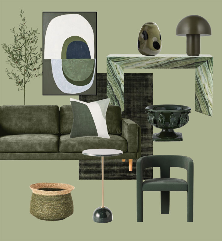
Colour Drenching Product Tile Homemaker the Valley

Adairs Nouveau Rug $549.99, Casa Blanco Roma Console $4,400, Casa Blanco Triah Chair $780, DecoRug Crescent Framed Canvas Wall art $84.96, Domayne Spots Olive Large Vase $109, Early Settler Finch 3 Seater Sofa $1,699, Early Settler Vaani Round Side Table $249, Freedom Cosh Table Lamp $69.95, James Lane Olive Tree $349.95, OZ Design Bella Feather Fill Cushion $89.95, Provincial Home Living Lucerne Compote $169.95, Provincial Home Living Talia Basket $69.95.

Step 1: Choose your canvas

First up, you’ll need to consider where you’d like to apply this trend. Although you can incorporate it in any space, colour drenching works best in bathrooms, hallways, and stairways – anywhere you want to create a sense of flow. You’ll notice that many luxe hotels and hospitality hot spots often opt for a single-hued bathroom featuring monochromatic terracotta colour tiles or sage green.


Step 2: Select your shade

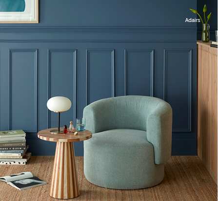
Be sure to consider the room’s purpose and the furniture you’ll be using before selecting your colour. Rich, bold colours can add depth and luxury, while softer hues create a sense of calm. If your goal is to make the space appear larger then steer clear from dark hues. It’s wise to think about the furnishing to be used in the room also. If you have a stunning navy armchair, this same hue or something a touch darker or lighter would be ideal for the paintable surfaces.


Step 3: Paint with purpose

Don’t be shy when it comes to painting – coat every surface, from ceiling to skirting boards. This step is a non-negotiable when it comes to colour drenching every surface must be painted with the same colour to create a seamless look.


Step 4: Add subtle pops of personality

When it comes to colour drenching, your décor plays a vital role in enhancing the overall effect. To add depth and visual interest, incorporate smaller pieces that break up the space while complementing the dominant colour. For instance, if you’ve chosen pink as your primary colour, select an artwork that features pink prominently but also includes a splash of orange. You can then subtly introduce more orange through flowers or a vase, creating a cohesive and harmonious look. By thoughtfully incorporating artwork, flowers, or vases, you can add layers of visual interest and break up the space, preventing the colour from feeling overwhelming. Once you’ve finalised your furnishings and décor options, your colour drench space is complete.


Ready to try colour drenching for yourself?

There you have it, colour drenching is more than just a fleeting design trend – it’s a game-changer that can elevate any space. By embracing a single hue, you can create a harmonious, visually appealing space that leaves a lasting impression on all who enter. So why not try it out for yourself? Introduce this innovative technique to your home and discover chromatic bliss!

For more home inspiration, join the Homemaker Collective to stay in the loop.
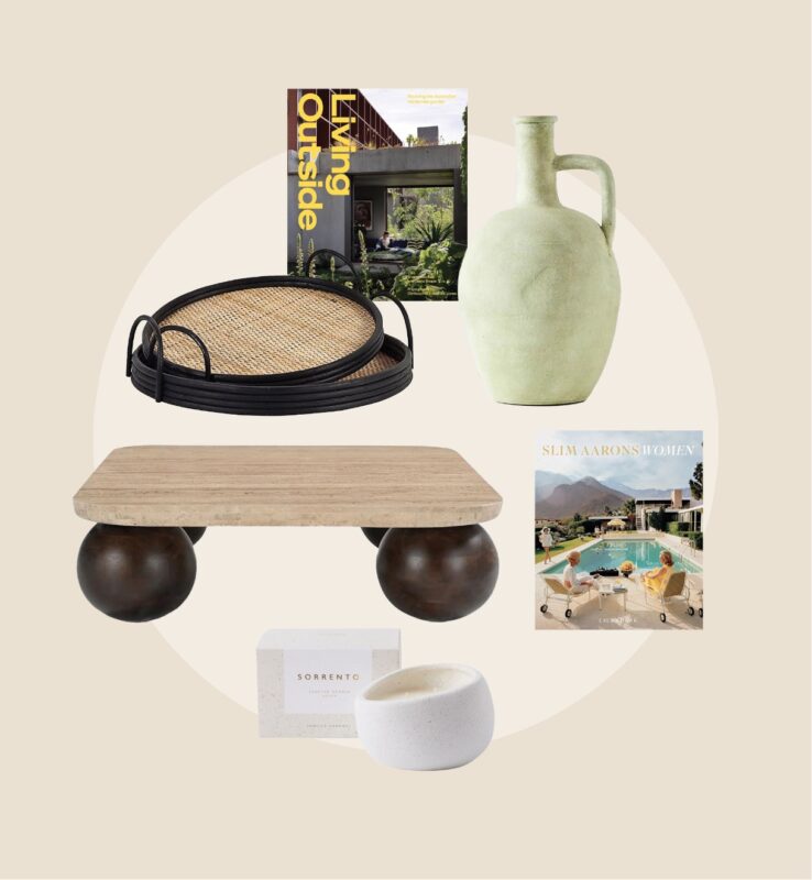
coffee table styling

The coffee table edit

The coffee table – it’s the central hub of our lounging, snacking, and Netflix-binging habits, and yet, it’s often the most neglected when it comes to styling. But no more! We’ve created the ultimate guide to coffee table styling, meaning your living room will never be the same. From the rule of three to making a vignette that’s both stylish and functional, we’re sharing our top tips and tricks to help you take your coffee table game to the next level. The best part? You can create a Pinterest-worthy coffee table with pieces found under just one roof – Homemaker The Valley, of course!


Find your table 

Before moving into the nitty-gritty of styling, be sure to begin with the foundation – the table itself. Whether you’re after a sleek glass surface or a rustic wooden slab, your coffee table is the canvas for your styling, so be sure to consider shape, size, and style. Round coffee tables are great for smaller spaces whereas rectangular shapes are best for larger spaces. When deciding on size, it’s recommended that your coffee table should be two-thirds the length of the adjacent sofa. 


Rule of threes and placement 

Now that you have your table sorted, let’s move on to the golden rule of styling; the rule of threes. This is a design concept that’s all about grouping objects in odd numbers to appear more visually appealing. When grouping three items together we recommend arranging your object to form a triangle, with the tallest item at the apex. This kind of formation will create an equilibrium and make the coffee table super balanced. 


coffee table styling; magazine, vase, candle

Adairs Sorrento Candle $44.99, Domayne Pence Round Tray Set of 2 $169, Freedom Living Outside Decorative Book $69.95, Freedom Slim Aarons Women By Brumby Sunstate $119, James Lane Bon Coffee Table $1,299, OZ Design Staghorn Fern Pot $149, Provincial Home Living Tulum Decorative Urn $119.95.


Book stacks are a must

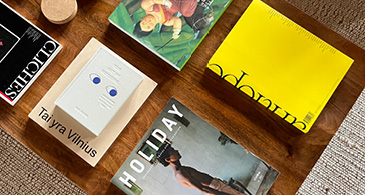
Books are one of the best coffee table accessories – they add height, texture, and a dash of entertainment. But don’t just throw any old book on the table. Consider colour coordination, size variation, and title selection. You’ll want the books selected to reflect your interior style as well as personality, so opt for ones that appeal to your interests whether that be fashion, cooking, or lifestyle. 


Think about height 

Take your styling to new heights (literally) by adding various heights to your table arrangement. You can do this by stacking objects like books and boxes, incorporating pedestals and risers to elevate smaller items, and adding greenery like flowers in large vases. 

With these coffee table styling tips and tricks, you’re ready to transform your coffee table into the centrepiece of your living room. So go ahead, get creative and make your space a true showstopper. For all your homeware needs and inspiration, head to Homemaker The Valley – your one-stop destination for making your house a home.  

For more home inspiration, join the Homemaker Collective to stay in the loop.
Get the colour psychology lowdown

Have you ever stepped into a room and felt a wave of emotions wash over you – be it a hospital, theatre, or even your living room? Well, this phenomenon has everything to do with the interplay of colours within the space you’re in (also known as colour psychology).

Colour psychology is pivotal in the interior design industry and understanding how it works is something that many industry experts have mastered. But being able to decode colour psychology isn’t just for the pros, anyone can do it! Keep reading to find out what colours evoke certain emotions and how you can use colour to create various atmospheres and moods within your home.

Shades of blue

When the colour blue comes to mind, you probably think of clear skies or the ocean, right? Both of these subconsciously influence a person’s mood because they’re affiliated with fond memories. So, when blue is utilised in interior design, it triggers a sense of calm, serenity, and relaxation, and even more so in the lighter shades. Darker hues evoke feelings of confidence, trust, loyalty, and dependability.

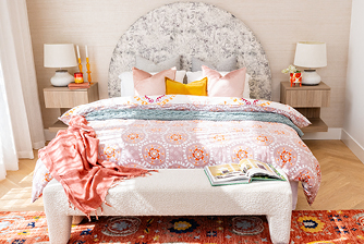
So, how to incorporate these into your space? Blue is best used in bedrooms and living spaces because you want these areas to feel calm and inviting. Use light shades of blue as a dominant colour in your bedroom by adding a blue coverlet to your bed or a pastel blue feature wall. When decorating your living room, we recommend using deeper shades of blue in various decorative accoutrements – think vases, artwork, and throw cushions.

Shades of green

Green is one of the more versatile colours and can be brought into almost every room in some way. Similarly to blue, green also evokes feelings of calmness because it has strong associations with nature. Green is thought to be tranquil and promotes growth, renewal, prosperity, and regeneration.

The best way to bring green into your space is through textural pieces like plants, rugs, and fabrics. Opt for statement furnishings in rich green velvets like dining chairs or sofas, add in a variety of foliage from hanging plants to petite succulents, and opt for contemporary Moroccan rugs with speckles of green throughout. The best part? Green can be added to any room within a house or apartment and even the most subtle additions can make all the difference.

Shades of red

Red can be a daunting colour to add to your space but it’s a real game changer! Red symbolises a range of emotions often depending on its intensity and contexts, but some common interpretation of the colour includes passion, energy, warmth, comfort, and creativity.

Shades of red are more suitable for kitchens where creativity is key. Ultimately red works best as an accent feature but be sure to balance with neutrals to prevent the space from becoming overwhelming. We also recommend creating a gradient by using various shades like maroon, burgundy, and rose instead of sticking to one stark shade only.

Shades of yellow

Radiant and cheerful, the colour yellow exudes warmth and sunshine which is why it’s often associated with youthfulness, energy, and fun.

Consider featuring yellow in nurseries or kids rooms because it is the ideal gender-neutral choice. When integrating yellow tones, it’s important to strike a balance where the shade is used in conjunction with other colours and design elements to create a harmonious environment. We recommend opting for a yellow ceiling accent or removable wall decals. For a more subtle yet impactful approach, add yellow fitted sheets to the bed to create a soft pop of colour in your bedding.

Shades of pink

To conclude, our final colour is pink – which is also the Pantone colour of the year, viva magenta! Pink has recently made a resurgence in interiors, especially dusty pinks which have been seen in a slew of Pinterest-worthy interiors. The shade often evokes romance, elegance, and harmony.

There’re so many ways to incorporate pink into your interiors but one of the best ways is through lighting. Look for pink-hued lamps, lampshades, or pendant lights to add a subtle glow of colour to your space. We also recommend introducing pink through bathroom accessories like towels, shower curtains, and bathmats.

As you decorate your home, keep in mind that colours do more than just look pretty – each colour can also help create the mood you want. So, whether you like calm blues, nature-inspired greens, bold reds, happy yellows, or elegant pinks, enjoy picking shades that resonate with you and the feelings you wish to welcome into your home.

Looking for more home inspiration? Join the Homemaker Collective to stay in the loop.